Thursday, 16 May 2013

Conclusion

To conclude - I'm actually really pleased with my product and it was a lot of fun to do. I did run into a few problems but nothing major and nothing that stopped me from completing the project. The things I really enjoyed in this project were: the new feature panel loops, it's probably the most powerful tool I've personally used within ZBrush and I'm so happy I used it even though I made a mistake with it regarding the pose and composing the renders within Photoshop, I've used Photoshop for quite a number of years so I feel at home whenever I use it and enjoy it quite thoroughly. The parts I didn't enjoy, well, actually there's nothing. A couple of things really did frustrate me like my problems I encountered when trying to pose but it was actually quite enjoyable trying to figure out how to fix the problems and move on with my work. Even when I completely changed my character it was actually quite exciting trying something different and because this is something I enjoy, work didn't feel like work and it all went very fast.

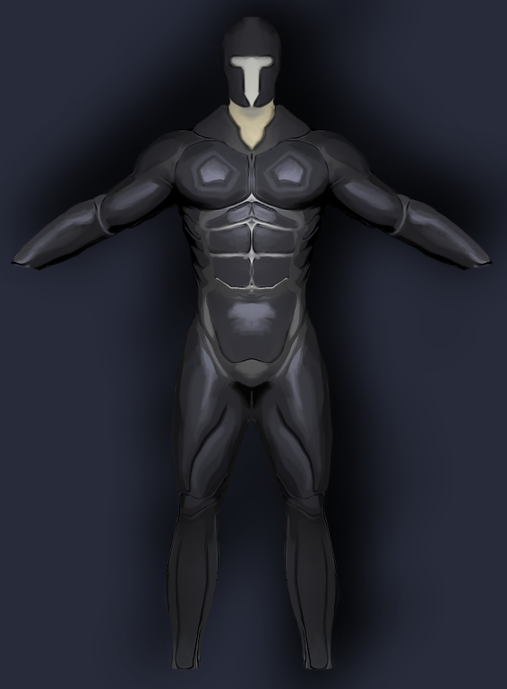
If I had another chance I'd definitely amend my biggest mistake during this project and pose as early on as I possibly could, preferably right after I had finished the major symmetrical work so that I could make asymmetrical poses and really make it interesting. Also in regards to the final image I feel I could have put a lot more effort into the background and given it some character and life. Although I felt with the pose I had to work with the background wouldn't help it much, besides I feel the stars really correlate well with the blue shiny armour I had given my character. I might also move off from humans - every character or face or bust I've done in ZBrush have all been human, I feel like I'm ready to move on from that and experiment with some alien type characters or just variations of the basic humanoid anatomy. 

All in all, this project has by far been the most fun for me to complete in the entire two years I've had at college - obviously because we got to choose exactly what we wanted to do, and since being introduced to ZBrush, I knew that I would have to use this program during this project. I'm pleased with my decisions and surprisingly happy with the result of the final image.


In regards to my schedule I'm actually a slight bit ahead of it, so even though you could say I wasted a little over two weeks, because of how much I enjoyed this work I got everything done in a small time scale and on time. This being this sixth week I've had nothing to do besides add images to this blog and publish all the pages!


I also completed everything stated on my project brief -


It's finished!

It's finally done so let's go over how I put together my renders in order to finish the image.


First of all I just wanted a basic background so I found a stock image of the galaxy and just placed it in different positions, in the exclusion layer mode. Then I used Gaussian blur so that it wouldn't take your attention away from the render. 


Next I added in my main render and deleted all of the background, this was easy because I used the magic wand on the mask render to get a silhouette to remove it. To get the shadow I simply duplicated the layer, filled it in black, added the blur and used the transform tool to first change the perspective of it, then to skew it, and finally to drop the vertical size.

Next I added an adjustment layer - selective colour just to increase the blacks to give it a little stronger depth, then just added a clipping mask to connect it to my main render.


I found a stock image of metal rust and decided to use that as a clipping mask on top of my main render.


Using the render I made earlier I erased all the areas I didn't want to have stand out and set that layer mode on darken. I then added an adjustment mask, brightness and contrast and increased them both to the max and finally made it a clipping mask.


The difference was quite subtle but I liked it a lot more as opposed to something that really stood out too much.


After that I added in the reflective map render and simply put it on overlay so that it isn't too noticeable, but because of the black background it made everything else darker so again I just clipped on a brightness/contract adjustment mask onto it.

and it is finally complete, the last steps I took were simply sharpening the entire image by making a new layer  and applying the image on it, and then slightly adjusted the levels. Finally added my name in the corner and it is done!

Here is the final layer composition in Photoshop.

and here is my completed render -


Additionally, I'm on time accordingly to my schedule so I haven't lost any time!


Posing and render time!

So I can't have my character looking like he's midway of doing star jumps so I have to pose him. I've had huge troubles with this and found a big mistake I made really early on during the project.
I had looked into rigging the character with zspheres using the transpose master tool and I did so successfully however when it came to posing which should have been the easy bit - because I had such a high polygon count whenever I moved a bone or joint it actually took around 30 seconds to react and it wouldn't even move as much as I wanted it to. I immediately realised I should've posed this character way earlier on as it is so easy using rigging in ZBrush. The mistake I made was all the way back when I was using panel loops, because panel loops requires you to have no subdivisions, naturally I wanted the highest subdivision so I was forced to delete lower subdivisions and because of that there was no going back but this is something I'll always keep in mind if I have to use panel loops for something I will render in the future
So how I actually posed the character was awkward, I actually merged all the subtools in my project and used the transpose tool but for very basic movements and nothing too drastic although I really wanted to completely move him around and give him a cool pose. 
This is the result of the pose, with his head lowered, arms lowered and legs moved out slightly.
These are all the images of the materials I have rendered out to use for my final image.


This render will be used to focus on the smaller panel loops like abdominal's to give it the shiny blue look I want

This render will be used as a reflection map just so that his armour has a little extra detail in it


This render will be used a depth map


This render will be used a mask


This is my main render which I will use all the other renders to compose with.


Alterations

It's almost time for the rendering process so I thought I'd go back to the model and see if there was actually anything I wanted to change, and I did find quite a few things.
This is my completed model with some finer details in it as well as a little more variation in the texturing.

FRONT ORTHOGRAPHIC

BACK ORTHOGRAPHIC

SIDE ORTHOGRAPHIC

Probably the most noticeable difference is that the smaller panel loops have been given a slight hint of blue just to make it a little more interesting but as I've mentioned before it will all look different in the render. Another thing which you may not notice because it is unrendered is the finer details I put into the abdominal's and the hexagon chest pieces but I feel every small detail will add up in the end. Last but not least I downloaded a insert mesh brush of a cog of some sort and just placed it where I felt it fit.


Progress!

Once I had panel looped the entire body a large part of my modelling was actually done, it was only the texturing and rendering which I had to do. 
I've never rendered a model and then proceeded to compose it in Photoshop using several renders so this is the part of the project I'm most worried about, but I'm confident I'll be happy with whatever I make as it is my first time. 
This is the final model

Although the entire armour has the same texture this will be changing as I move forward with renders and Photoshop  for now it is fine. The skin also is quite irrelevant since it all can be altered and messed around with in Photoshop, however the skin is just painted with a skin material I got from the pixologic website.
Now for some render tests to see how this will actually pan out in the long run.


From the test BPR renders I really am pleased with the results - especially with the result of the fiber mesh. I really dislike the eyelashes, in fact I couldn't make realistic looking ones even after trying for quite a while, so I'll probably just remove them all together since you won't even see them in the final render. 


Polygroups, polygroups, and even more polygroups.

For this part of my modelling process all I had to do was make shapes, sounds simple and it is, except it is pretty long winded. By using my tablet and the mask pen brush with symmetry on I just started to mask bits out, CTRL+W to make mask a polygroup then CTRL-SHIFT-CLICK the polygroup I had just made to hide it so that I wouldn't accidently overlap polygroups. I did this for the entire body, and since I had already made a body mesh it was easy to follow the human anatomy.

FRONT ORTHOGRPAHIC


BACK ORTHOGRAPHIC

SIDE ORTHOGRAPHIC

As you can see all these different colours on the body are separate poly groups which will become different parts of the armour using panel loops.
A problem I did however encounter and maybe a disadvantage to using panel loops rather than extract is that it doesn't actually make a separate subtool for the panel loops you have just made - or I just don't know, and couldn't figure out how. However I did find a work around which was to duplicate the entire subtool once panel looped - and since all the parts that I didn't poly group were in one uniform group I could hide all of that and simply delete hidden and there I'll have a separate subtool with just my panel looped polygroups in it.
This is the actual result of the panel loops with the textured metal material.


This was the end of week 4 and I was right on schedule even after the step back with the entire new character.


Back to where I began; the face!

So although the face or it's features aren't the main attraction of my character I do still need something there. Since in the past I've done many busts and faces I wanted to get through this quickly and not waste time with it. In the final render the face won't be hugely noticeable so I don't need to waste too much time on this.


I wanted a mean, angry look to my character so this was mainly achieved by just lowering the inner brow using the move brush. The rest of the face was almost entirely done with the clay buildup brush, just building and smoothing as I went along, this process was quick and effective and I had a face I was fairly happy with within the hour.
Something wasn't right though, I gave him the angry look, but he wasn't "badass" enough, so this is where Fiber mesh comes in!


and just like that he looked a lot better. Fiber mesh is such a powerful tool in Zbrush and really simple to use. I started with a large mask over the majority of his jaw and chin, then used fiber mesh to give him a little bit of a stubble. Then I focused in and made a mask for a mustache and the hair under your lower lip. I used fiber mesh to make that hair a little more thick and the result was that there was a lot more depth to his facial hair. The eyebrows were done in the same fashion, the only difference is that they a lot more thick.

New ideas needs new reference, new reference means new concept art.


As I mentioned I'm going for a nanosuit look now so what better to refer to than Crysis, which is the majority of the reference I collected. Something I really learnt from the reference I  picked up is that similar to what I want to achieve their suits too follow the human male anatomy so it was perfect for me to look at.
One thing I won't be incorporating is their 'tube-like' look to their armour, as if it were all made from hundreds of tubes or something similar, I want my armour to be clear, shiny metal.

From this I again took my orthographics from the model I made and started to make concept art for what I actually want as a end product. This is what I came up with:


Again it does follow the human anatomy quite well but the most noticeable difference from my previous piece of concept art is that it covers almost the entire body, excluding parts of the face and neck. 
Using the mask pen and lasso to create polygroups I believe I can easily mimic the shapes and ideas presented in the above concept art. Once I have my entire body polygrouped I'll then proceed to use panel loops and move onto finer details and texturing.

This marks the end of week three and although I've taken quite a large step backwards I feel I've taken two forward in the sense that I know exactly what I'm doing and I know exactly how to do it, so now it's just a matter of doing it. I'm confident in three weeks I can complete everything I need to, the past two weeks haven't been so productive but I've learnt a lot and I plan to do a lot now.


Changing my approach to my design.

I'll be blunt in my reasoning for my change of design and that one reason is ZBrush 4R5, after experiencing and messing around with the panel loops function in the new version I just found that I could potentially have so much more control over the robotic armour side of things than just simply using basic brushes to build and mold form.
Panel loops is like a more advanced version of extract, where extract uses masks, panel loops uses polygroups, as many as you like.
From just a short session of using polygroups and panel loops I came up with this


From these two images you can see all the polygroups involved, and after you use panel loops you'll actually have new polygroups for the edges, so instead of having one, for example with a square shaped polygroup, you'd have 5-6 in total.
This is how it looks not in poly frame view.


As you can tell I have so much more control over what I can do with this instead of manually making forms or even using extract. 
So all in all, I've decided to give my character a complete makeover, and instead of being part-cyborg, I want him to being wearing some form of a nanosuit for his entire body, possibly a helmet but not covering the main features of his face (eyes, nose, mouth). A character from the future representing some sort of space army force.
I'll have to get together a new mood board of reference for my new approach. I don't think I'm too late in changing my ideas since I got through my first concept rather quickly and actually adapted to using panel loops quite efficiently so I don't think I'll lose any time in regards to my schedule.


Using concept art to get a start in modelling

First Concept Art

So as mentioned before I did carry on with my idea of using my basic concept mesh to actually make my concept art from. However compared to the end product of the video I last posted they're a lot of changes, I went in and started to focus on human anatomy properly and also using the transpose tool posed the character slightly differently, namely the arms being down.


FRONT ORTHOGRAPHIC

BACK ORTHOGRAPHIC

SIDE ORTHOGRAPHIC

This is the front of the character and as you can see half of his body is robotic, the design I followed was basically following human anatomy. I found myself really interested and into the idea of his armour following the human muscle groups almost completely. I feel like it would integrate really well into the rest of his body.
You may also notice a robotic replacement eye, a little reminiscent of the DragonBall Z scouter, but I believe that if nothing is on his face his body armour might just look like armour and not actually a part of him.
One thing I didn't actually draw on this was the pipes I wanted to include, just a few pipes on his torso connecting the robotic armour to his actual body. Additionally I didn't actually go on with my original idea of using the samurai trousers and instead decided to replace that just with a rope belt to keep a little bit of traditional design, almost nostalgic of what he used to be. 
Similarly the back follows the muscle group design too, a little varied as in it's not completely accurate but all in all it is still the same concept. 
On the side orthographic you can see the arm muscles a lot more defined and clearly, again these designs are almost following human anatomy completely accurately. 

This marks the end of week one and so far I'm actually a little ahead of schedule which is a pleasant surprise.


Concept modelling

So before I actually start doing any concept art I thought this would be a good exercise and method to get going for it. I wanted to make a basic human mesh so that I could just screenshot it from the 3 standard orthographic points of view and then draw some concept ideas on top of it using Photoshop.
As you can see I've started with a base mesh from the Gnomon Workshop just to get me going that little bit faster. After subdividing it a few times I get stuck in using clay build up with the soft circle alpha (Alpha 06), just to start building in forms and then smoothing them out.
This didn't have to be anything detailed or major just enough for me to know it's a human, basically the silhouette was the most important part of it.
It didn't take long at all, probably around ~20 minutes just to quickly come up with this, but using this I could come up with multiple concept ideas if needed and I have something to start with when I want to begin modelling if I choose to use this mesh.


Besides using this for a base to start concept art, this was also a good exercise for me to get back into ZBrush because it's been a long time since I've actually used ZBrush for organic sculpting (actual people/humanoids). So this was a successful attempt to get my skills back up to par of where they were before and from now on hopefully to improve a lot more.

Wednesday, 15 May 2013

Ideas generation

I didn't put much thought into what I wanted to do in fact it was a really random thought, but I liked it and decided to go with it. My idea was some sort of part cyborg samurai. The concept was that he was an injured samurai that had been somehow sent to the future and repaired by having his body infused with robotics. Seems bizarre but I know that it would look good.

He would look like a traditional samurai except half his body is robotic, with pipes connecting to his body acting as some form of veins transferring blood or other bodily fluids around so that his body circulates properly, and of course he'd be equipped with a traditional samurai sword. 

Here is the first moodboard I put together with some reference I felt to be relevant to this character design. 


You can see a fair amount of samurai swords in the mood board which I feel are key to when you're going to design any type of samurai, there's a form of elegance to them which you can't just model out of imagination. 
Towards the top right you can see the robes that a samurai wears and even though half his torso would be robotic I'd still like to keep a traditional look to him by wearing those robes. The rest of the images are all robotic/cyborg and these were just to be used as reference for the type of modelling I'd like to achieve even if it isn't the same design at all.

The Open Project

This is something I've personally looked forward to since we got news about it, and the minute I heard about it I knew what I was going to do, a full character design using my favourite program - ZBrush.My aim was to take what I'm best at and evolve it into something new, whilst enjoying it. So take ZBrush, I've used this program quite thoroughly throughout the past year but I wanted to do something new using it. I've already made high-res models, and I've turned those high-res models into game-res ones too. So this time (and it was a pretty quick decision) I wanted to do take a high res model and turn it into a still image render using Photoshop as my program of choice to compose the different renders together to make something that's visually appealing.

This is my project brief customised for the current open project -
http://www.mediafire.com/view/?n5uu22pbmnrgqem

In this project brief towards the end there's a time schedule of when I aim and plan to complete certain goals I've set myself. I plan to keep track of time and how much I do each week.


So without further ado it's time to get together some reference and begin with some concept art!